Sentry lands a sweet new logo
![]()
Three months ago David and I decided that it was time to ditch the Helvetica “S” and get ourselves a real logo. It was a difficult task — far more difficult than we anticipated. Over the course of several weeks we had looked at dozens of portfolios, trying our best to find a style we connected with. At the end of this stack of portfolios lived Mackey Saturday.
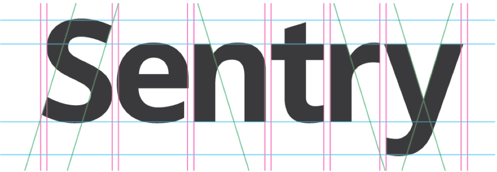
After the discovery phase of the project, we decided that we wanted to go in the “notification/alert” direction. We also really liked the idea of having a simple triangle-shaped mark. Mackey went to work and came up with the lovely work you see above. He also paired it with this logotype:
Altogether, it was exactly what we wanted. Simple and bold and representative of a new way to do error monitoring. Mackey described the mark as having “forward movement, growth, and a natural progression.” We described it as “cool.” The rest is history.
We hope you enjoy the new logo as much as we do. Make sure to check out Mackey’s work on Dribbble. Tell him we sent you.